Locate Deviations in a Time Series
An outlier is a data point that is outside the range of expected values. This page shows you how to locate deviations beyond thresholds in a time series.
Currently, the feature is only available for logs queries. For information on outliers in metrics queries, see the Metrics Outliers page.
Graphing log queries to find outliers
You can graph log queries to determine where there are deviations from normal behavior in a time series. Locating outliers can help you understand the behavior trends of a time series. For more in-depth information, see outlier operator.
To graph a log query and determine outliers, do the following:
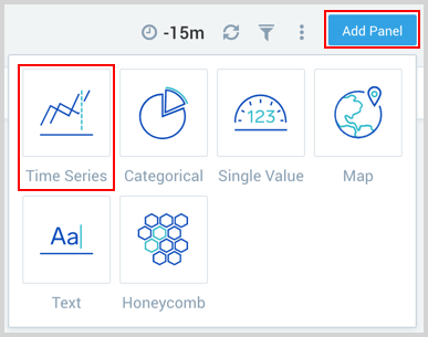
In Sumo Logic, go to and open a Dashboard (New).
In the upper right corner click Add Panel and select Time Series as the panel type.
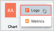
By default, the query builder is set for a Logs query.
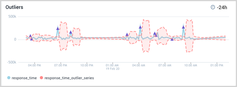
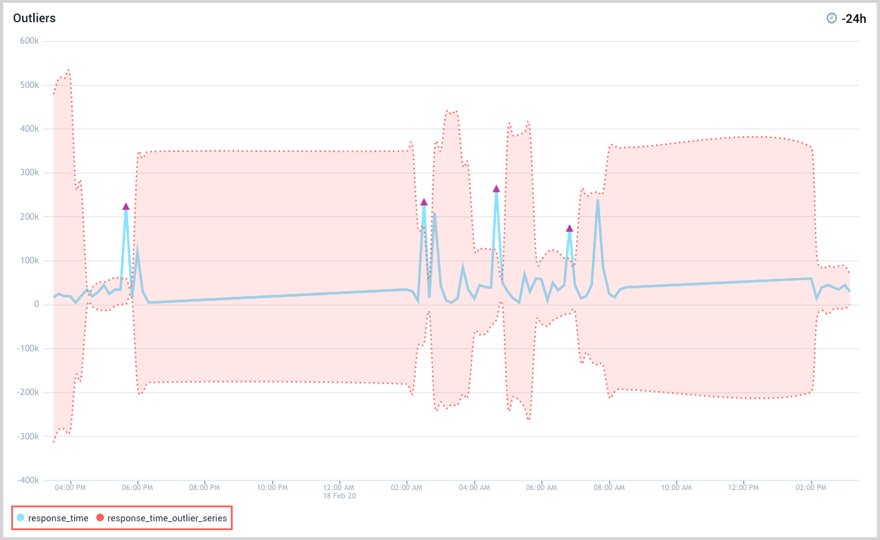
Enter your log query in the text field on the right and press Return to run the query. We used the following query for our example.
(_sourceCategory=airflow-service)
| parse "in time *" as response_time
| timeslice 10m
| max(response_time) as response_time by _timeslice
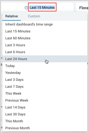
| outlier response_time window=5,threshold=3,consecutive=2,direction=+-Adjust the time interval as needed by selecting the time display next to the clock icon in the upper right corner and choosing an option from the dropdown list. We selected a 24 hour time interval for our example.
The outlier graph appears in the window below, with the outlier series shown in the legend.
Customizing the graph
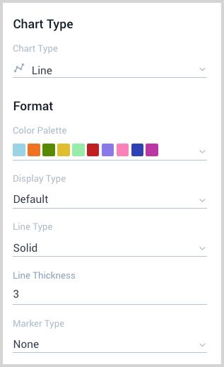
You can easily modify the look of the chart by changing the color palette, line type, and thickness, to name a few of the customizing options. For outlier graphs, there is a separate set of options you can choose from to modify the look of your chart.
To customize the visual appearance of the graph, do the following:
Go to the far right panel and click the Display icon, if it is not already selected.
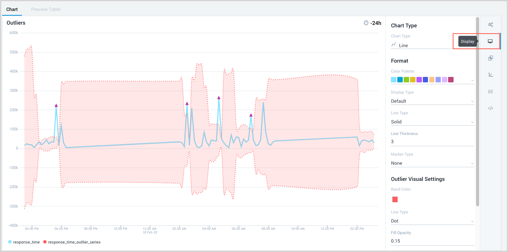
Make Format selections in the right panel as described in Customizing a chart.
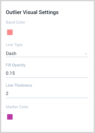
Make Outlier Visual Settings selections for the following:
- Band Color. The fill that defines the outlier region.
- Line Type. Boundary line of the outlier region.
- Fill Opacity. Denseness of the fill color in the outlier region.
- Line Thickness. Thickness of the line bordering the outlier region.
- Marker Color. Color of the marker for an outlier peak value.
In the upper right corner, click Add to Dashboard.

The panel appears on your dashboard.