Dashboard (New) FAQ
How do I convert a Classic Dashboard to the new dashboard framework?
There is not an automatic conversion method from classic dashboards to the new dashboard framework. The best way to convert a classic dashboard to the new dashboard framework is to manually transfer over the panels you want to migrate.
How do I add filters to the new dashboards?
In the new dashboard framework, we have created a variables feature that follows the standard set by other dashboard providers. Variables take the place of filters from classic dashboards and can be used in a similar fashion to reduce the scope of data displayed on your dashboards.
The new dashboard variables will function much like a parameterized search that allows you to define where you want to put your variables and flexibly reuse them throughout the queries.
See details on how to filter with template variables.
The biggest differences between variables and filters are:
Unlike filters, you have to declare variables in your query in order for them to filter the panel. To leverage a variable in a query you can reference it via mustache syntax as follows:
{\<variable_nam\>}}Unlike filters, you get full control over where and how the placement is used in your query. Because of this, you can use variables to do a lot more than just filter your query. You can use them to dynamically change time slices across your panels, replace operator arguments, or serve as inputs for further transformation before doing the filtration.
Variables can be derived from metrics metadata, logs queries, or a custom list. Any logs query that outputs a table can be used as the source of a logs variable, and any metadata you send with metrics can be used with your variables.
You can nest metrics variables so that the selection in one variable impacts the selection in the next one.
What is the difference between a categorical and time series panel?
The categorical panel type contains charts that graph data across categories. This includes:
- Bar charts over categories
- Column charts over categories
- Pie Charts
- Tables over categories
- Bubble Charts
- Scatter Charts
The time series panel type is designed to graph data over time. Time series panels accept aggregate fields with epoch values (milliseconds since 1970). You can use the timeslice operator to provide a time series.
The types of charts you will find in the time series panel include:
- Area
- Bar
- Column
- Line
- Table
How do I overlay logs and metrics on one panel?
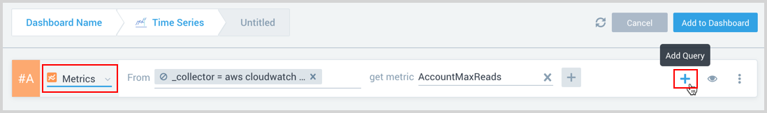
One of the valuable new features in new dashboards is that you can graph data on to the same panel across data sources very easily. Inside of each dashboard panel, you have the option of having up to 6 metrics and 6 logs query rows. To create a panel with both logs and metrics derived data, press the Add a Panel button, select Time Series, and you will launch the panel builder.

To switch between a metrics query row and a logs query row, you just have to select the Logs query dropdown after the #A and change it to Metrics. To add multiple logs or metrics rows, hover over the last query row and press the + button.
If you are in a time series panel, you can only graph items over time. This means that every logs query must be timesliced if you are going to graph it in a time series chart. If you want to count across categories, pick a category chart.