Numerical Single Value Charts for Searches
You can use single value charts to display results for a search or metric query as a single value, for at-a-glance analysis. This page shows you how to create and tailor single value charts for searches. For information on single value charts for metrics, see Create and Tailor Single Value Metrics Charts.
About single value charts
A single value chart is useful for summarizing a time series in a single value. For example, you might want a dashboard panel that shows the number of errors generated by your site over the last 24 hours. Here's an example of a Single Value chart.
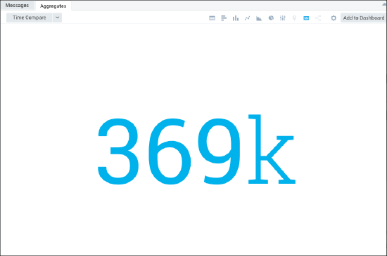
By default, Sumo presents a value rounded by thousands. For example.
- 1,234 is presented as 1.23k
- 1,234,567 is presented as 1.23M
- 1,234,567,890 is presented as 1.23G
Creating and customizing numerical single value charts
Single value charts allow for only three digits in the returned values, and use SI prefixes to define the values. If the query returns more than one value in the Aggregates tab, only the first value is displayed in the single value chart. If your query returns no results, or a null result, the single value option is grayed out. A search query that returns a single value can be as simple as the following:
error | count
The results for our example is as follows:

This section shows you how to create and customize a numerical single value chart for searches.
Creating a numerical single value chart
Create and run a search for a single value.
Click the Aggregates tab and choose Single Value.

The single value chart is appears with default colors and text.
Click Add to Dashboard to save the chart as a panel.
Customizing a numerical single value chart
After you've created a numerical single value search chart, you can modify the display:
Modifying chart properties
To modify the properties of the chart, do the following:
On the Search page, click the Aggregates tab and select the Settings (gear) icon.
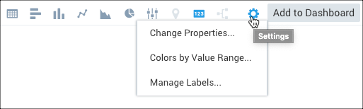
Select Change Properties, and modify the following options as desired:
When Data is Available. When data is available for a query, the chart will use the following properties:
- Color. Override the default color of text with the color you select.
- Display color on the background. Activate this check box to use the selected color as a background. The text will be black or white depending on the color value.
- Numeric Value. Activate this check box to show a numeric value. Deactivate the check box if you do not want to display a number.
- Unit. Define a unit of measure to append to the value. The maximum length is 6 characters.
When Data is not Available. When no data is available for this query, all When Data is Available options are ignored. But if the settings below are not configured, the chart will display no information.
- Use the following settings. Activate this check box to display customized values when no data is available.
- Default Value. Enter the text or value you would like to appear in the chart if the query does not return any results. The text you enter will be displayed when no data is available. The maximum length is 8 characters. If you specify a numeric value, it triggers the defined color thresholds.
- Background color. Select a default background color to display when no data is available. The default is gray.
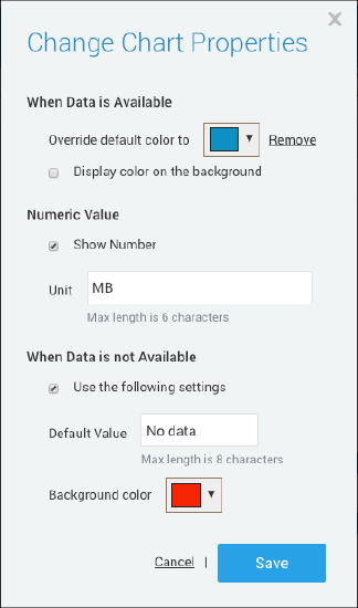
Click Save to apply the changes.
Modifying colors by value range
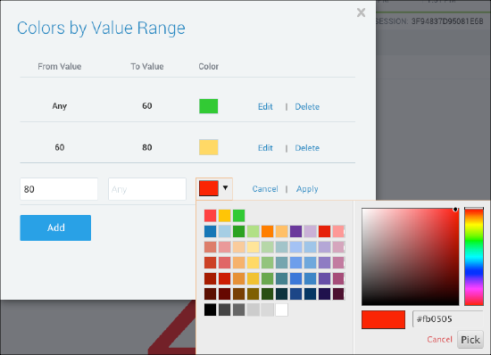
You can specify three value ranges, one for red, yellow, or green. However, you do not have to specify all three. Sumo evaluates the value ranges in red-yellow-green order.
If ranges overlap, the threshold setting for the red range take precedence over the yellow range settings, and the settings for the yellow range take precedence over the green range settings.
To modify the colors of the chart by value range, do the following:
On the Search page, click the Aggregates tab and select the Settings (gear) icon.
Select Colors by Value Range. The Colors by Value Range dialog appears.
To add a color value range, click Add, specify a range, and select a color from the color chart.
This setting maps value ranges to red, yellow, and green. The appropriate color is used in the chart, based on the chart value.
(red) From Value and Tue Value. Enter the minimum and maximum values that define the range of values that you want to appear in red.
(yellow) From Value and Tue Value. Enter the minimum and maximum values that define the range of values that you want to appear in yellow.
(green) From Value and Tue Value. Enter the minimum and maximum values that define the range of values that you want to appear in green.
noteYou can leave the upper or lower bound for a value range blank to include all values greater than or less than a threshold in the range.
Sumo Logic evaluates the value ranges in red-yellow-green order. If the ranges overlap, the threshold setting for the red range take precedence over the yellow range, and the settings for the yellow range take precedence over the green range. In our example, the threshold values are evaluated as follows:
A value of 80 or greater is red.
A value that is 60 or greater, and less than or equal to 80, is yellow.
A value that less than 60 or less is green.
To modify a color value range, click Edit, specify a new range (as described in the previous step_, select a color, and then click Apply.
Click Save.
Modifying chart labels
You may want to add a title and brief description to the chart to clarify the value shown on the display for an at-a-glance understanding of the data. You can add both title and description labels, or just one of these options. This section shows you how to easily complete this task.
To modify the labels on the chart, do the following:
On the Search page, click the Aggregates tab and select the Settings (gear) icon.
Select Manage Labels, from the dropdown list.
Do the following, as desired:
To add a chart Title, select the Enable check box and enter the Text for the title. The maximum length is 25 characters. The title text appears at the top of the chart, above the numerical value.
To add a chart Description, select the Enable check box and enter a brief description of up to 125 characters. The description text appears at the bottom of the chart, beneath the numerical value.
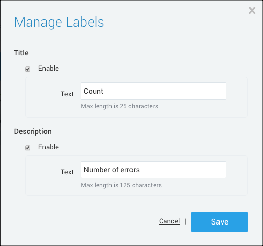
Click Save.