Span Analytics and Queries
The Spans page allows you to filter and aggregate your trace data at the raw span level so you can understand the performance and behavior of your application services.
Spans page
To open, go to + New > Spans.
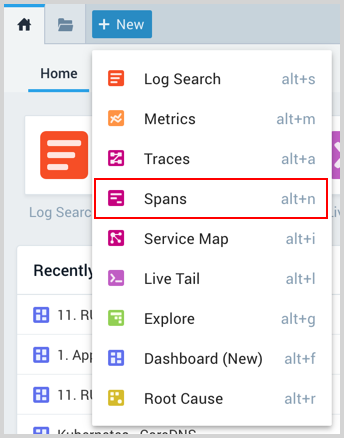
A new Spans page opens. Data is displayed once you run a query.
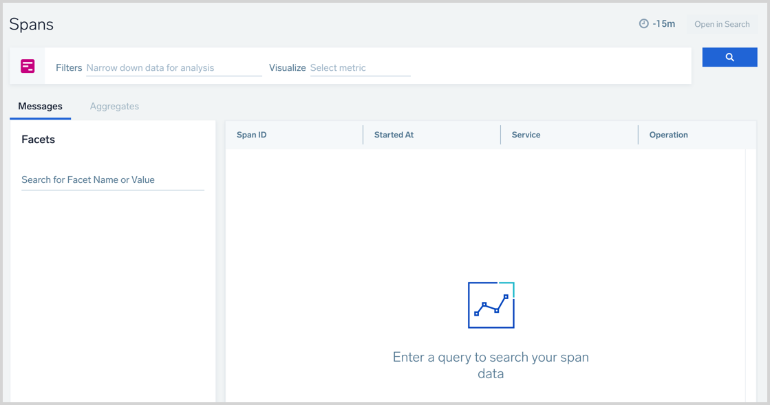
From here, you can filter and aggregate by any standard or custom span attribute (tag) and create charts to visualize results. If you find something interesting, you can quickly explore your raw span records in the Messages tab.
For more advanced use cases, you can further enhance your query by clicking the Open in Search button, which opens a new Log Search of your spans based on your query. Here, you can use Search Query Language to investigate further.
Tracing must be enabled in your account to use this functionality. Contact your account team if the only thing you see is an infographic.
This micro lesson provides an overview of Span Analytics, and describes the term Span in the distributed tracing and the benefits of Span Analytics. It also explains how to perform Span Analytics in Sumo Logic UI.
Spans query
You can build a spans query using the provided input fields. By default, you'll see an input for Filters and Visualize.

Once you click the text area of an input field, you'll get a dropdown menu that provides the available options detected from your data. You can manually type into these input fields or select from the dropdown of available options.
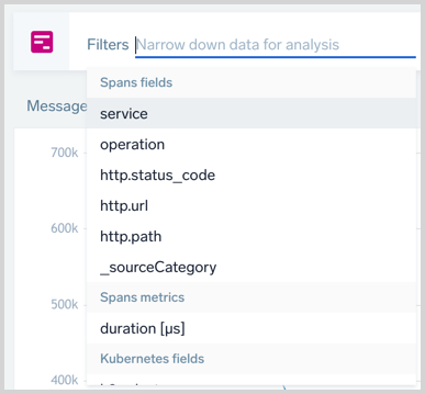
Filters narrow the scope of the query. Enter metadata values that match the data you want to search. You can add multiple filters to focus on specific data.
Each Trace includes up to 10,000 spans to better support monitoring for long-running and complex transactions. New spans can increase credits consumption.
Aggregate your data
Aggregating raw spans can produce better insights by selecting the subject you want to visualize and the type of aggregation.
Visualize sets the metric to aggregate the filtered data by. The two default options are:
- count. Counts the field you set. Typically you want to count spans, such as, to show how many of them are in any particular category. However, you can count distinct occurrences of any other field, such as IP addresses or pods.
- duration. Conducts the sum, avg, min, max, or pct of the span duration metric.
You can instead use custom numeric metrics from your data by typing the name of the span tag field carrying a metric into the box.
You can visualize multiple different metrics at once.
- If you define Visualize, you'll see another option to set Group By value. You can have the aggregated results grouped by time or other fields.
- If you want to display a time series, you need to Group By time and select the granularity.
- If you prefer to have aggregated data without a time dimension, pick the appropriate dimensions to Group By.
- You can group by time and other fields at the same time. When you do time and another dimension, you can create a stacked bar time series.
- If you define Group By you'll see another option to set a Limit value. This allows you to reduce the number of results by an order.

When you run your query with Visualize and/or Group By, the results tab will automatically switch to Aggregates.
Set Time Range
You set the time range of the query at the top right of the Spans page, above the search button. Tracing data retention in _trace_spans index is the same as default log index retention. See Time Range Expressions for details.
Run query
Once you have defined your spans query, with filters and aggregation if desired, click the search button to run the search. It looks like the following:
You can pause or stop your search by clicking the appropriate icons below the search button.
Search Results
Messages (including Facets) are always provided to show you the raw output of your query. You will have Aggregates if your query has set the Visualize option.
Messages tab
The Messages table shows your raw span data. You can click on any row to open a right-side Details pane (similar to the one in Trace View) showing span details and options to navigate to other parts of the system from there.
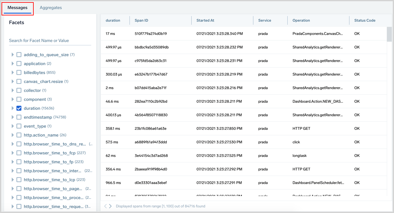
- To move a column left or right, hold click and drag it to a different location in the table.
- To adjust column width, click and drag the vertical line in between the columns.
- To reset column width to the default size, double-click the vertical line to the right of a column name.
Facets
The Facets panel provides a list of all the metadata fields returned from your search results and allows you to show or hide fields from the results table.
The content of the Facets panel is affected by your current active filters and time range, but shows any found metadata tag (span attribute) with its top 10 values, including any custom tags you may add to your data. By default, the fields used in the query are shown in the Messages table.
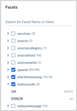
- You can adjust which fields are displayed in the raw span messages table by checking or unchecking the box next to the field in the Facets panel.
- Use the search field to easily find the metadata from your data. This applies the filter to both tag names and their values.
- The number of values found for each is displayed for your reference.
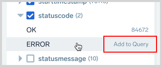
- Add and remove fields from your query by hovering over a field and clicking.
Aggregates tab
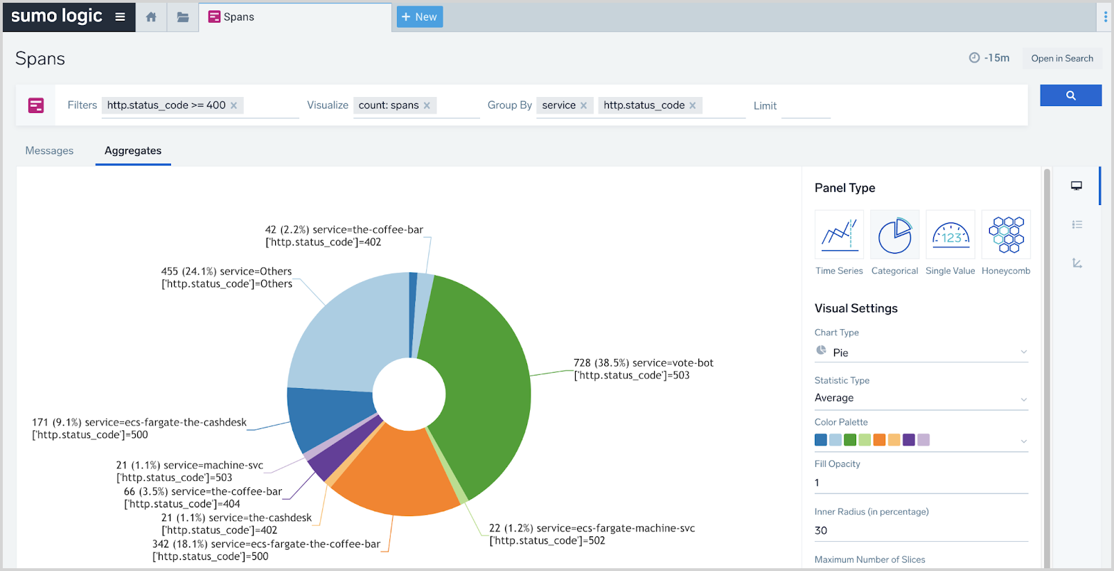
The Aggregates tab shows your data charted. See Panels from Dashboard (New) for details on the settings. However, note that not all settings will be available on the Spans page. The interface will only show you available settings.
Add to Dashboard
You can add to Dashboard as long as your total dashboard-originated _trace_spans read volume does not exceed 200x of your tracing ingest. Contact your Sumo Logic representative for paid subscription service options for volume requirements exceeding 200x of your tracing ingest.
To add your aggregated span data to a Dashboard:
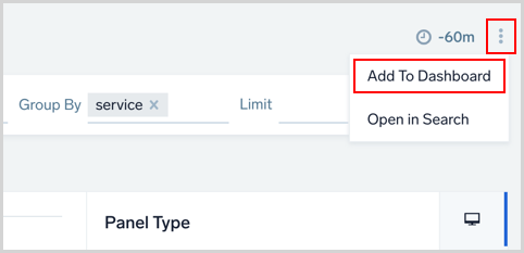
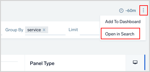
- Click the three vertical-dots icon on the top right of the Spans page and select Add to Dashboard.
- In the Add Panel to Dashboard window provide a Panel Title and a name for the Dashboard. Once the name is entered you'll have an option to select Create New Dashboard with your name.
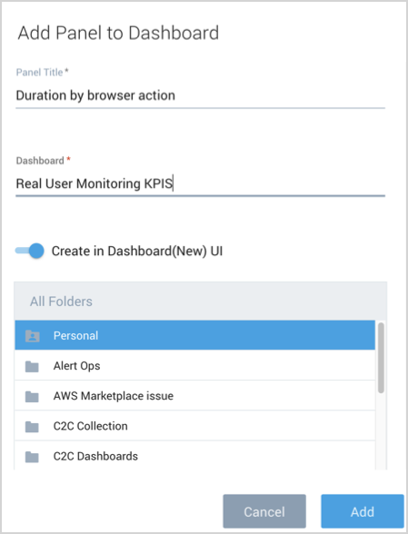
- Click Add when you're done assigning which Dashboard to add the Panel to.
Open in Search
To further enhance your query, you can use the Search Query Language for more advanced use cases by opening a Search of your spans. Click the three vertical-dots icon on the top right of the Spans page and select Open in Search.
Examples
Compare performance of different release versions
To compare the performance of different release versions defined by a custom tag assemblyVersion, you can graph the 95th percentile of latency of a microservice in the function of time by version.
Use the filters or facets features to find the appropriate service in the dropdown and select it. Then, select to visualize duration’s 95th percentile and pick a group by time, for example, 1-minute granularity and the assemblyVersion custom tag that carries version information. That’s it!
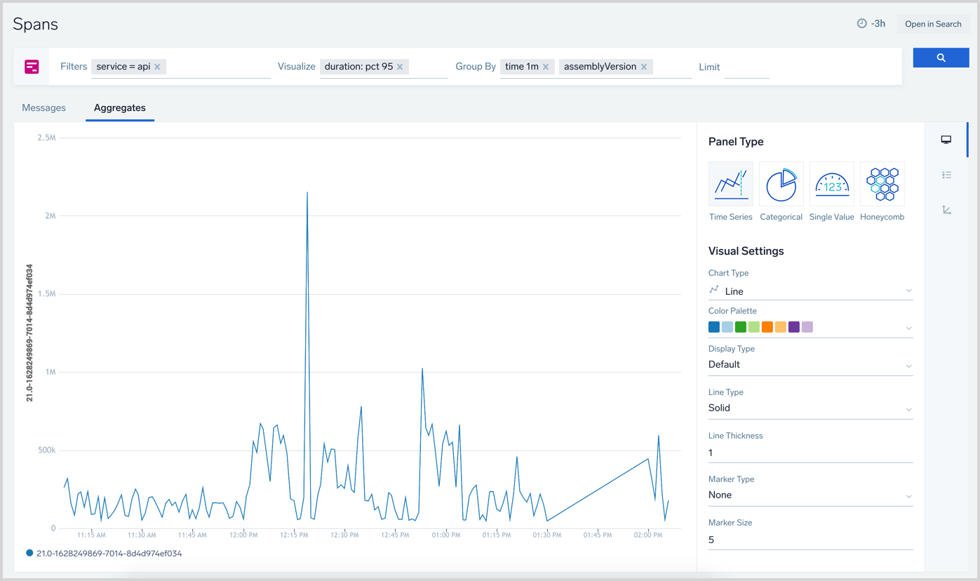
You can customize your chart by picking different visualization types and colors.
Find HTTP errors distribution
Next, let’s see how to find the distribution of different HTTP errors among our services. Not as a time series, just a pie chart to find which service and status codes are most common.
Here is the simple query we used to visualize that data:
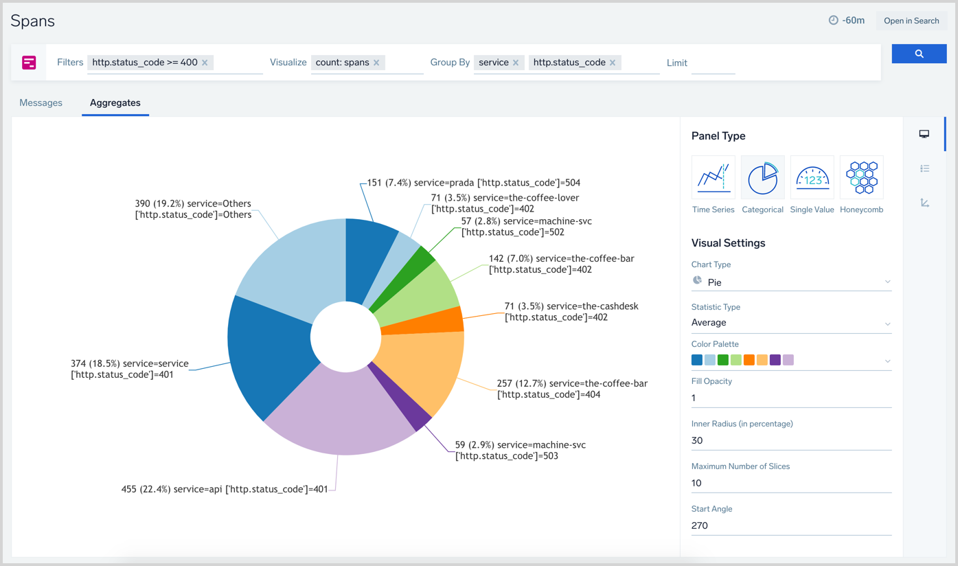
It’s now easier than ever to drill down into the information you care about. Note that our query only includes spans with codes from 4xx and 5xx ranges and visualizes the count of such spans, broken down by two dimensions, service and status code. Easy!
The number of cases you can realize with this is unlimited. In addition to the above examples, you can aggregate and visualize the content of custom metrics in your spans, and filter and break them down by any field, including custom tags. These can all be presented in any of the available chart visualizations.
If any further query customization is required, you can click the Open in Search button to edit your query, making it a great place to start queries in a way that still allows further technical refinement. Especially if you try to solve a use case that requires more than the current functionality of the Spans page, such as the following:
- A stacked time-series chart with more than two non-time dimensions. You can only set Group By to Time and a single dimension.
- Visualize multiple series with more than one count operation.
- Use OR operations in filters. Filters are concatenated using AND logic.
- Use mathematical operations between metrics.