Services List and Map
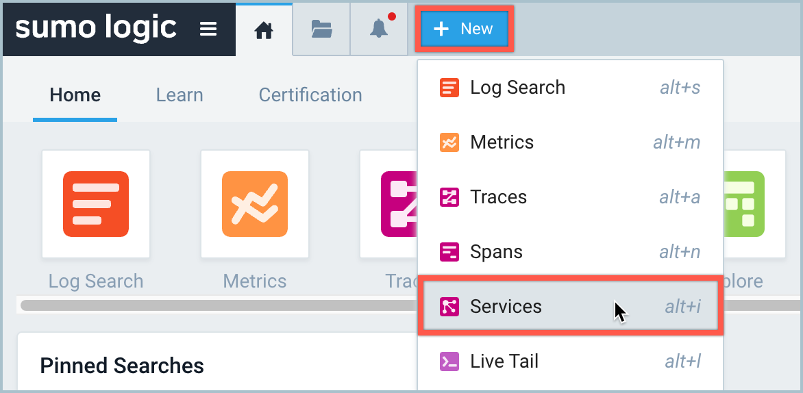
To open the Services List and Map, click + New > Services.
Services List view
The Services List view provides a compact, high-level overview of your application service health insights and KPIs. You can filter and sort your KPI data using the filters and column headers.
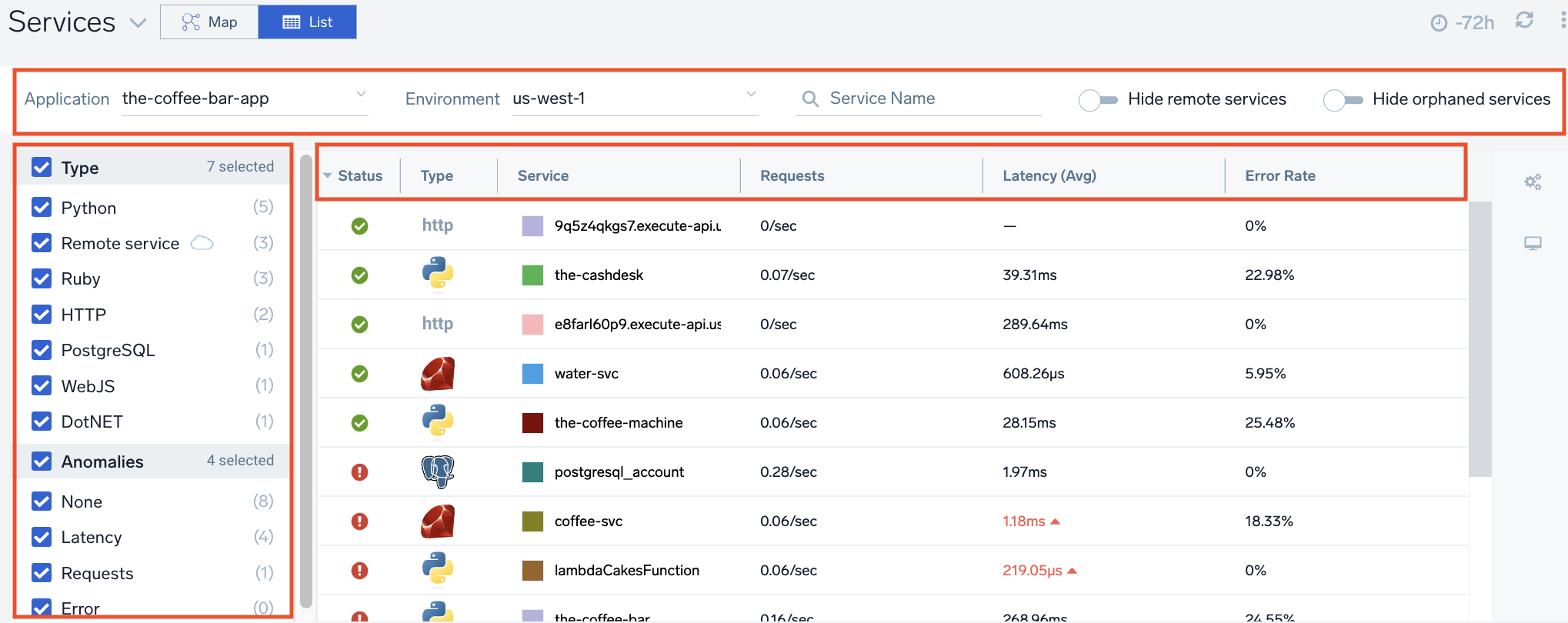
KPIs listed in the table reflect the previous 15 minutes of data. Clicking on any service will open the Entities panel allowing for further drill-down.
General Settings
Configure anomaly detection in General Settings (learn more).
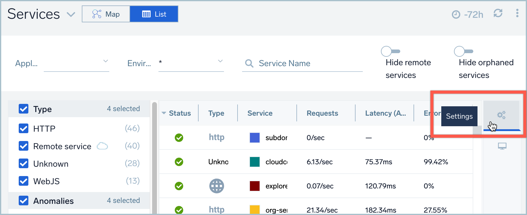
Your Services List and Map settings are specific to you (not your team) and will be preserved in your browser's local storage.
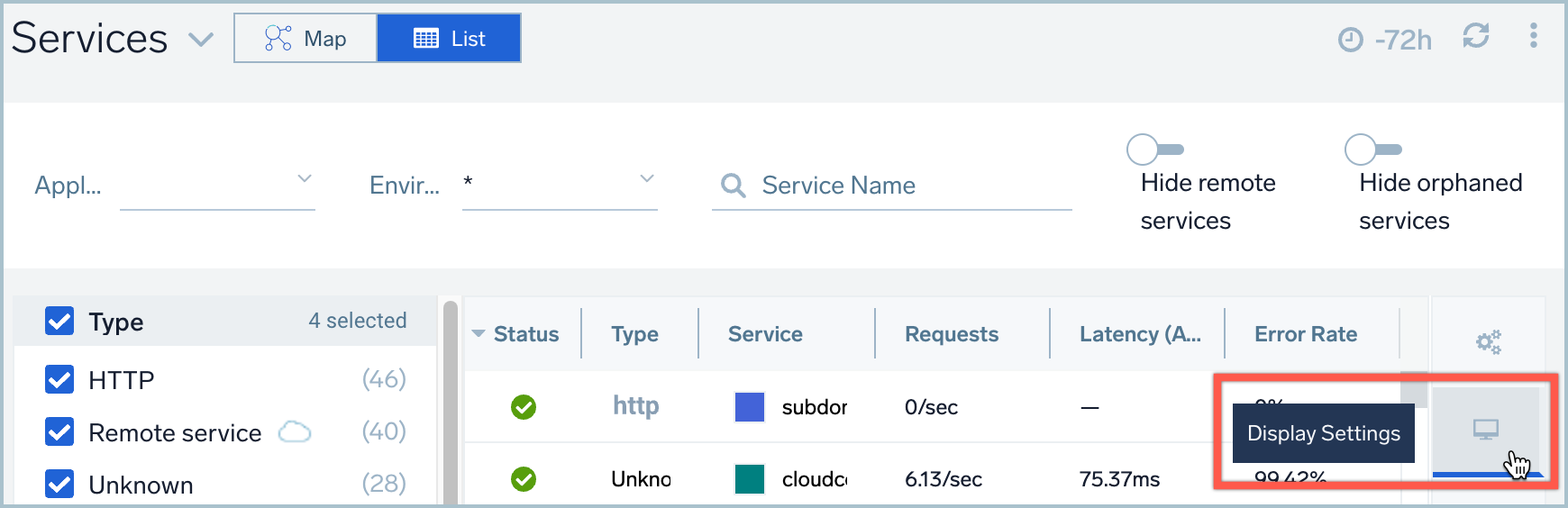
Display Settings
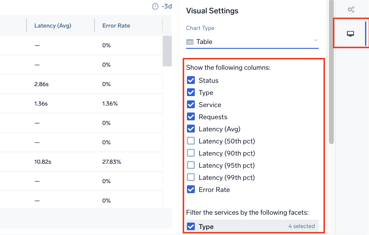
Display and hide columns using Display Settings.
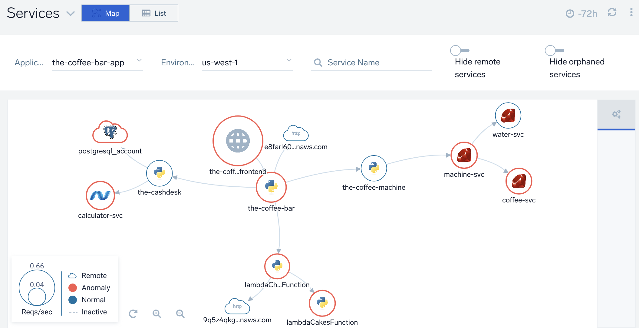
Services Map view
The Services Map view visually maps out your application environment, giving you a greater understanding of your application architecture, hierarchy, and dependencies between monitored microservices. Health and load of each microservice is reflected in size and color to help you spot potential problems and bottlenecks in your application infrastructure.
Services Maps are built automatically from distributed tracing data in real time as it arrives in Sumo Logic. You can:
- Zoom in on the map to see a more granular level of detail, or zoom out to get a higher-level overview
- Hover over a service to see its connections to other services and the last 15 minutes of activity in terms of latency, requests, and errors
- Click on a service to open the Entity Inspector for further drill down into traces, metrics, and the service dashboard
- Filter by application, if your tracing data has the application tag (
application=[app-name]) - Filter by environment (up to 10 values), if your tracing data has the deployment environment tag (
deployment.environment=[environment]) - Search for a service by name
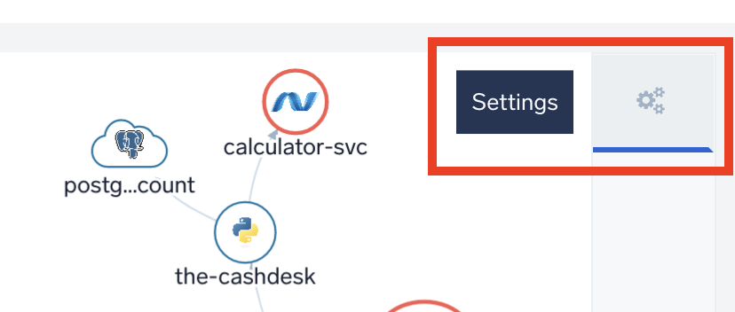
General Settings
Configure anomaly detection in General Settings (learn more).
Map legend
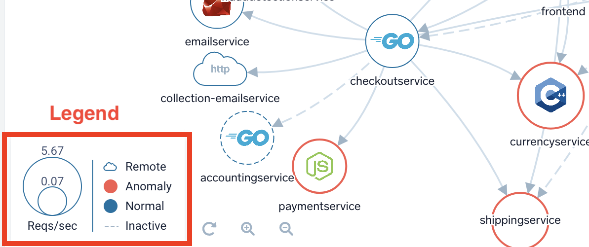
- Color of services:
- Red represents anomalies.
- Blue indicates normal, expected activity.note
You can configure your own thresholds for anomaly detection in your General Settings.
- Shape of services:
- Circles represent connected application services
- Cloud icons represent remote services like databases or external APIs, which are automatically detected for you in client traffic even without using direct instrumentation
- Arrows map out connection activity between services and their presence from the last 72 hours.
- Circle and arrows with dotted lines represent services or connections that have been inactive an hour or more.
- Size of services: Size is based on service activity, where large circles are more active compared to smaller circles that are less active.
Anomaly Detection
An anomaly is a spike in latency and errors or a dip in requests. Here's how to configure your own threshold settings for anomaly detection.
Automatic
Automatic anomaly detection is enabled by default, with the Worst Case option selected. This will render services to be displayed as a red circle if at least one of the KPIs (latency, errors, requests) has had an anomaly in the last 15 minutes AND the anomaly was not present 7 days ago at the same time. Optionally, you can explicitly choose one of the other KPIs - Latency, Error, or Request.
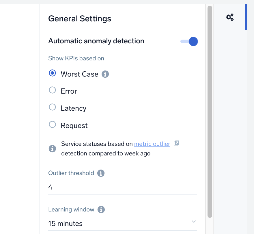
The standard metric outlier operator is used to detect this. You can adjust the sensitivity and Learning window of the outlier detection in the settings to make the logic more or less dependent on occasional spikes.
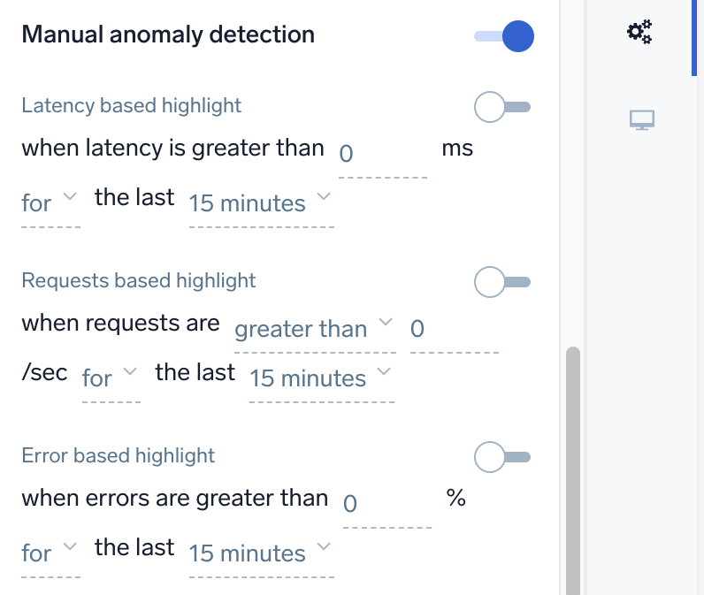
Manual
Manual anomaly detection allows you to specify different detection settings for each KPI. Click the toggle switch to manually enable or disable each KPI highlight as desired.
Services Dashboard Panels
The Services Map and Services List panels, available out of the box, enable you to explore your application environment and review all traces from your Dashboard. You can duplicate or add multiple panels with different filtering or queries to refine views and support your organization.
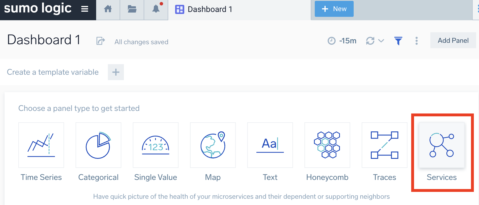
To add a Services panel to your Dashboard:
- Open an existing Dashboard or create a new Dashboard (+New > Dashboard New).
- On an existing Dashboard, click Add Panel > Services, or, on a new Dashboard, click Services.
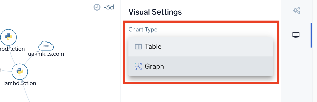
- When the panel configuration page opens, go to the Visual Settings > Chart Type, dropdown and select Table (Services List) or Graph (Services Map).
- (Optional) Select from the dropdown menus to filter by the following:

- Application. Your application name. You can use this if your tracing data has the tag called
application=[app-name]To pass the variables from dashboard filters, setapplication={{application}} - Environment. Your production, staging, or development environment name. You can use this if your tracing data has the tag called
deployment.environment=[environment-name]. To pass the variables from dashboard filters, setdeployment.environment={{deployment.environment}} - Service(s). Your application name, which should be always there. To pass the variables from dashboard filters, set
service={{service}}.
- Application. Your application name. You can use this if your tracing data has the tag called
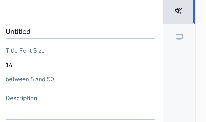
- Go to the General tab to configure your panel details (name, Title Font Size, and Description).
- For Table chart type only: Go to Display Settings and set the column data and services you'd like to see displayed.
- Click Add to Dashboard. The panel loads in your Dashboard to review your applications and services according to filtering.
See the Dashboard (New) guide for additional information and options to create panels, configure filters, create and filter with template variables from dashboard headers, and more.