Create a Funnel Chart
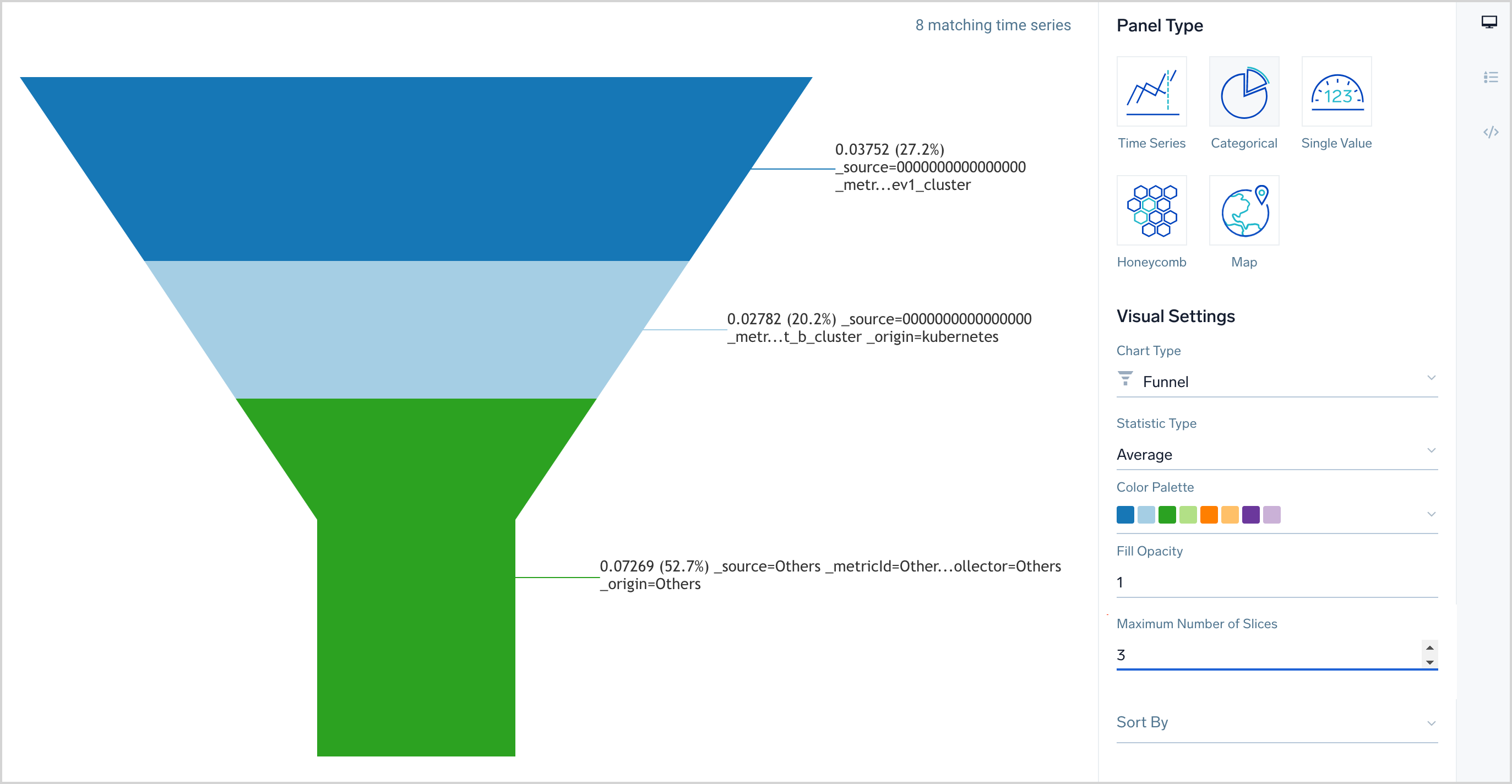
A funnel chart visualizes categorical data. It’s useful for visualizing the status of a process with sequential steps. For example, in a development environment you could use a funnel chart to understand how many bugs are in each state of the bug tracking process, from “Triage” to “Closed”.
Create a funnel chart
- Enter and run a metrics query in the Metrics Explorer.note
Don't include the
outlieroperator in your query, as it isn't supported in this chart type. - Click the Chart tab.
- Under Panel Type, click Categorical.
- Under Visual Settings, choose Funnel in the Chart Type pulldown.
- Statistic Type. Use the pulldown to select a statistic type: Average, Count, Minimum, Sum, or Latest.
- Color Palette. Choose an alternative color palette, if desired.
- Fill Opacity. You can adjust the opacity of the categories in the funnel chart by selecting or entering a decimal value greater than 0, and no greater than 1.
- Maximum number of Slices. By default, a maximum of 10 categories are displayed. Enter a different value, if desired.
- Sort by. By default the categories in the chart aren’t sorted. To sort them, select Label or Value from the Sort By pulldown.
- Sort Direction. This option appears when you choose a Sort By option other than none. The default value is Ascending. You can choose Descending from the pulldown.
Example funnel chart

Notes
- Funnel width. The width of the funnel reflects the number of datapoints at each stage of the process.
- Category label. The label for each category is the combination of the metric value, the percentage of the time series that fall into the category, and the field by which the time series are aggregated. Sorting. By default, the categories in the funnel chart are not sorted. You can sort them by the value of the metric or the label of the metric, either in ascending or descending order.